Color Theory explorations
This assignment follows your exploration of the additive color wheel that include primaries, secondaries, tertiaries and tints and tones of those colors and your monochromatic value scales in eleven steps, while achieving optical movement through understanding vibrating complimentary pairing
 |
| Student Work color wheel |
 |
| Student Work - value scales |
 |
| Andy Goldsworthy Made in and of the landscape |
Objectives
i. Activate a 2D Plane via color and design
ii. Inspirations will be taken from Geometric studies and Quilts
iii. Activate a Unit to System Relationships
iv. Understanding Primaries, Secondaries, Tertiaries and the tints and tones of those and how to create them additively
v. Understanding figure and ground visual weight to be equal
Do the math
You need 3 units on the vertical axis at 3" each
And 3 units on the horizontal axis at 3" each (9 square in total)
How large will your overall grid be? XX"
Float that square onto your Bristol paper, allowing for the measurements on both vertical edges to be equal and those on the horizontal to also be equal.
 |
| Amish Quilt |
PROCESS
PART 1
1. Experiment with different geometric drawings in your sketchbook. You will need minimum 4 different ideas. Allow each to develop
2. You need to make a grid that is 3 units vertical edge and 3 units horizontal edge.
3. Divide your square into 3" squares. Thus, totaling 9 units
4. Your drawing in the grid will separate figure from ground
5. Make sure you understand where your P + S will go by noting them on your sketch.
You need to make 2 tints somewhere in your design.
You need to make minimum of 3 tertiaries somewhere in the design
Allow the light to "flow" from a tint into a tone. See examples below.
5. Make sure you understand where your P + S will go by noting them on your sketch.
You need to make 2 tints somewhere in your design.
You need to make minimum of 3 tertiaries somewhere in the design
Allow the light to "flow" from a tint into a tone. See examples below.
 |
| Student Work Figure Ground Reversal |
 |
| Student Work Figure Ground Reversal |
PROCESS
PART 2
Now you are ready to translate your template into a complimentary pairing in the overall grid, thus exchanging figure and ground relationships.
1. PAINT: Choose your complimentary pair either of O &B or R &G or Y + V
This pair must be equal in saturation of hue and intensity, allowing for illusionary OPTICAL VIBRATIONS to take place as an illusion
2. Somewhere towards the grid's center you need to make a fully saturated / optically vibrating compliment pair in two squares or four
3. Adjacent to those painted units, paint in two or three units with tints of your complimentary pair
4. Adjacent to those painted units, now make tones (tertiary colors) of your original pair by adding it's complimentary color
5. Continue to allow your designs to become darker and darker, thus, less saturated in intensity of color as they move outward
6. Complete all units with at minimum 5 different values or tones of tertiaries (plus one tint with complimentary pair + white)
7. Use a pencil to sign your work on the lower edge with date
On the lower left edge title the work "Figure Ground Reversal"
 |
| Josef Albers - excellent example of figure ground reversal |
 |
| Paul Klee painting |
 |
| Student Work |
 |
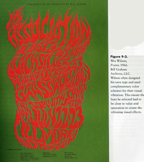
| Wes Wilson graphic design |
CONSIDER
When painting design areas that reverse your color methods, allow for figure in one square = A (blue) and ground = B (orange) then in other squares figure = B and ground = A
WARNING
When applying paint, paint as smoothly as possible
Do NOT + H20 to your acrylics!
Inspiration Sources may include:
Use four as entries in your VISUAL LIBRARIES
Amish Quilts Tribal Rugs Josef Albers Wes Wilson
Larry Poons Op Art Jesus Rafael Soto Andy Goldsworthy


